How to Write Gym Website Copy That Converts Visitors Into Enquiries
Click Below To Share & Ask AI to Summarize This Article
Why Most Gym Websites Fail at Their Primary Job
A gym website has one primary job: to convert a visitor who is curious about the gym into someone who enquires, books a visit, or joins. Most gym websites fail this job not because they look bad, but because the copy is written from the gym’s perspective rather than the visitor’s. Pages list equipment, describe the gym’s history, and talk about the owner’s passion for fitness — none of which answers the question the visitor is actually asking: “Is this the right gym for me, and what do I need to do next?”
Writing website copy that converts requires understanding what a prospective member is thinking when they land on your site, structuring the page to answer those questions in order, and making the next step obvious at every point. This guide covers the pages that matter most and what to put on them.
The Visitor’s Mindset: What They Are Actually Asking
A prospective member who finds your gym website — whether through Google, a referral, or an Instagram link — is typically somewhere on this decision path:
- “Is this gym near enough for me to use regularly?”
- “Does it have what I need for my goals?”
- “Is it the kind of place I would feel comfortable?”
- “What does it cost and what do I get?”
- “What should I do next if I want to join or try it?”
Your website copy should answer these questions in roughly this order. A homepage that leads with the gym’s founding story answers question five before answering question one — the visitor has to work to find the information they need, and most will not bother.
The Homepage: Your Most Important Page
The homepage has one job: convince the visitor to stay and take a next step. Every element should serve that goal.
The headline
Your headline should answer “what is this and where is it” in one sentence. Not an inspirational tagline (“Transform Your Life”) but a clear description: “Independent gym in [Town] — strength training, group classes, and personal training for adults of all levels.” This headline immediately tells the visitor whether they are in the right place. According to Sport England Active Lives survey
The subheadline
One to two sentences expanding on what makes your gym distinctive: “We’re a small, independent gym with a community of members who take their training seriously. No intimidation, no contract lock-in — just good coaching and well-maintained equipment.”
The primary call to action
One clear button above the fold: “Book a Free Tour”, “Claim Your Free Trial Week”, or “View Membership Options”. One CTA, not three. Multiple CTAs on the same section reduce conversion because they create decision paralysis.
Social proof
Three to five genuine member reviews or testimonials near the top of the page — not at the bottom where most visitors never scroll. Specific, outcome-focused testimonials (“I’ve lost 2 stone in five months and actually enjoy going to the gym now”) convert better than vague positive sentiment (“Amazing gym, great atmosphere”).
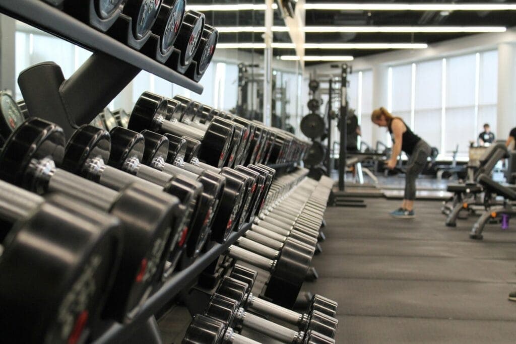
A real photo of your gym
Not stock photography. A genuine photo of your gym floor — well-lit, clean, with equipment visible — tells the visitor more about whether they would feel comfortable there than any amount of copy. If your current gym photos are poor quality, a single session with a local photographer (£100–200) is a worthwhile investment in your website’s conversion rate.
The Membership Page: Where Most Conversions Are Won or Lost
The membership page is where a visitor who is already interested makes their decision. It must clearly answer the pricing and value question without requiring them to email or call to find out basic information.
What to include
- Your membership options with prices: Show all your tiers with prices and what is included in each. Do not make visitors request a price list — most will not, and those who do are less likely to convert than those who can make the decision immediately.
- What is included in each tier: Equipment access, class access, guest passes, PT sessions, opening hours — specific and accurate. Vague descriptions (“full access”) lead to unhappy members who expected something different.
- A direct comparison: A simple table showing the three tiers side by side is the clearest format for membership options.
- The joining process: “How to join” in three steps — removes uncertainty about what happens after clicking the join button.
- FAQ: Five to eight questions that the gym’s enquiry inbox receives regularly. “Can I freeze my membership?”, “Is there a joining fee?”, “Can I come for a free trial?”, “What equipment do you have?”. Answering these on the page reduces the number of enquiries that need manual responses and removes objections before they become reasons not to join.
The CTA on the membership page
A clear, prominent button next to each membership option: “Join Now”, “Start Your Free Trial”, or “Book a Tour to See More”. At least one option should be a low-commitment entry point (free trial, free tour) for visitors who are not yet ready to commit — capturing these visitors into a conversation is far more valuable than letting them leave.
The About Page: Brief, Specific, Human
The about page is not where you tell the full history of how you came to open a gym. It is where a prospective member decides whether they trust you and whether the gym’s culture fits them. Two to three paragraphs is the right length:
- Who runs the gym and what their background is — briefly
- Why you opened this specific type of gym and what you are trying to create for members
- What the coaching team looks like and what they specialise in
Include genuine photos of the team. A gym with a visible, named, credible team converts significantly better than one where no one knows who works there.
Page-Level Copy Principles That Apply Everywhere
- Write for the visitor, not the gym: Every sentence should pass the “so what?” test from the visitor’s perspective. “We have 200 pieces of equipment” is gym-centric. “You’ll always find what you need, even during peak hours” is visitor-centric.
- Short paragraphs and scannable structure: Most website visitors scan rather than read. Use headers, bullets, and short paragraphs. Dense blocks of text on a gym website go unread.
- One CTA per section: Every major section of every page should have one clear next step — do not end a section and leave the visitor wondering what to do.
- Specific beats vague: “3-minute walk from the high street” is more useful than “conveniently located”. “Classes run Monday to Saturday, 6am–8pm” is more useful than “regular class schedule”. Specificity builds trust and removes uncertainty.
- Proof beats assertion: “We’ve helped over 200 members achieve their first 5K” beats “We’re passionate about helping members reach their goals.” Claims need evidence; evidence converts.
The Thank You Page: Most Gyms Waste It
When a visitor submits an enquiry form or books a trial, the thank-you page they land on is a high-engagement moment — they are interested, they have taken an action, and they will read whatever is on that page. Most gym websites show a generic “Thanks, we’ll be in touch” message and nothing else.
Use the thank-you page to: confirm what happens next (when they will hear from you, what to expect), give them something of value (a link to your class timetable, a tour video, a brief note from the coach they will be meeting), and ask them to share with a friend or follow on social media. This small addition can generate referrals and social follows from people who are already warm and engaged.
GymPal lists independent gyms across the UK. Claim your free GymPal listing — and give every visitor who finds you through search a consistent, professional first impression before they even reach your website.

I am Adam Hall, a dedicated fitness professional with over ten years of experience in the UK’s fitness industry. I earned my Master’s degree in Sports Science from Loughborough University and have worked with several top fitness studios across the UK. My certifications include a Level 3 Personal Trainer Certificate and a specialised Strength and Conditioning Coach accreditation.
Starting my career as a personal trainer, I quickly moved up to manage multiple gym locations, overseeing their operations and training programs. Beyond managing gyms, I regularly contribute to well-known fitness magazines and have been featured in articles for “Health & Fitness” and “Men’s Health”. My passion also extends online where I run a popular blog on GymPal’s AI-powered directory platform detailing insights into choosing the right fitness venues across the UK. With hundreds of posts reaching thousands of readers monthly, my goal is to influence positive changes in how people approach health and exercise throughout the country.